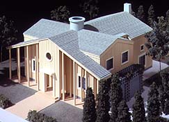
 An architect-designed home, built for an affordable price:
LIFE proves again that it can be done. For this year's Dream House,
Michael Graves plays on the past with his distinctive, celebrated style,
and creates a new house for all America.
An architect-designed home, built for an affordable price:
LIFE proves again that it can be done. For this year's Dream House,
Michael Graves plays on the past with his distinctive, celebrated style,
and creates a new house for all America.DOWNSTAIRS
MICHAEL GRAVES BELIEVES in "letting a house reveal itself," in pacing rooms from the public to the private. No one should open a front door and tumble into a living room, he says. Standing in the vestibule, visitors can see, as if through a telescope, deep into the heart of the house. Beckoning from nearly 40 feet away is a fireplace, but to reach it guests must pass through a sequence of refined spaces--what Graves calls "a kind of yellow brick road." The ROTUNDA is crucial to the trip. Lit from the oculus in the ceiling, this foyer can be lined with niches to show off a treasured collection. It's an eyepopper and also a kind of architectural traffic cop, ordering flow: this way to the KITCHEN, that way to the hearth. The surprise at the end is the LIVING ROOM--expansively wide and high, with cozy alcoves and a floor-to-ceiling display of glass. But the house isn't just for impressing guests. Graves laments the "unceremonious" way most of us enter our homes, through garage or backdoor. His rotunda, however, is accessible even from the garage, assuring everyone a proper entrance.
UPSTAIRS
GRAVES GIVES THE HOUSE cohesion by providing connections between the two floors. At both the landing and the top of the switchback stairway, round window-size openings allow for looking into the living room below. The rotunda gets repeated upstairs--a circular balustrade in the center likewise inviting those above to peer down through the opening into the foyer. (A piece of clear acrylic can be fitted into the four-foot round hole to safeguard children and pets.) Design is as thoughtful upstairs as down. A seven-by-seven-foot bank of multipaned windows in the master bedroom takes up much of one wall, filling the room with natural light. A walk-in closet is sensibly located next to the master bath; a smaller closet may be left as open space and furnished with a dressing table. Each child's bedroom is big enough for two twin beds. Another nice touch: Parents' and kids' rooms are at a civilized remove from each other (the children even have a vestibule to theirs), but close enough for a grown-up to tend to a little one in the middle of the night.UPSTAIRS PLAN
THE DREAM HOUSE needn't be clad only in the cedar board-and-batten siding. Graves suggests brick, clapboard or stucco, depending on preference and region, and an imaginative use of color: Clapboard might get a slate blue, for instance. Whatever the treatment, the house will retain its look: important but inviting. Symmetrical features, such as the trellised alcoves, make the house look wider than it really is, and the tall columns and prominent center panel give it height. The long loggia and deep portico leading to the oversize front door (designed so two people can stand in the threshold side by side) are stately and sheltering. What can't be seen from the front is the depth of the house. The living room is designed almost as a separate pavilion--those inside will feel they're in a distant wing, far from the bedrooms upstairs. Saving this room for the back of the house makes it more private. This is the choicest part of the property, after all, far from the noise of street traffic and passersby.EXTERIOR VIEWS
GRAVES HAS ANTICIPATED the wants of different families. For homeowners who desire a separate family room, ONE OPTION replaces the country kitchen with a spacious den. Two sets of French doors fill the room with sun and can be thrown open to a side garden on a summer day. The shift eliminates the home office and costs the kitchen some square footage, but counter space stays the same--19 feet in all--and the kitchen is now even closer to the dining area. The breakfast alcove has also been moved, to be near the kitchen. (Owners might want to put a service window in the wall between.) The powder room now occupies an area used as a hall closet in the primary plan, but there is still plenty of space to stash coats: Two closets remain in the vestibule. An ingenious SECOND OPTION has been designed by Graves for "people my age who don't want to climb stairs." The master bedroom moves to the first floor, and the garage is housed in its own detached building with a full second story, a place that can be put to use as an extra room or simply as storage. For convenience's sake the washer and dryer move to the first floor, where they are cleverly fitted into a small room beyond the rotunda. The plan may be just as appealing to couples with children still at home. Parents might welcome the privacy of having their bedroom downstairs. And the arrangement gives flexibility to the upstairs, which can have three bedrooms, two extra-large rooms or four child-size rooms: more than enough space for any growing family.By Jenny Allen Reporting: Janet Mason
